Friday 1 April 2011

What kind of media institution might distribute your media product and why?

I have chosen IPC media to publish my magazine as they have experience in publishing successful music magazines such as NME and UNCUT. Seeing as these are the only two magazines of this kind that they publish, there would be room for my magazine too. The reason that I have chosen IPC Media is because although they already print top music magazines, they don't publish one in the array of genres that I have produced and mainly for a female audience. This means that I would be bringing them a new kind of magazine and therefore adding to the company. Overall, I believe IPC Media to be well established in the area of publishing music magazines so this would make me confident in giving them my media product to distribute.

Thursday 31 March 2011

How did you attract/address your audience?

On my front cover I have used bright colours for each cover line which would appeal to my target audience.The sell lines all relate to a variety of music genres which the reader would give attention to because the target audience have an assorted music taste. The cover lines are short and sweet but give necessary information which the reader would then want to find out more about. The model I have chosen is young, fresh-faced and good-looking with an engaging look at the camera to draw the audience in. Her general style would engage the reader because my target audience have an interest in fashion and her summery dress would appeal to them but because she has strong facial features her attire does not detract away from her face. The fact that the cover artist is around the same age as that of the target audience would please and encourage them to buy the magazine as they would be able to relate to her and aspire to be like her.  

My contents page is also full of vibrant colour to capture the readers attention. It is designed to appeal to a older teenage/young adult female audience with the images of young, successful female artists, nightclubs and live festivals. The separate editor's letter located at the top of the page uses chatty, informal language so that the reader can relate to the editor and be engaged enough to carry on reading the magazine. The separation of each genre of music makes it easy for the reader to pick which features in which genres they'd be most interested in reading without them having to scan through lots of features.

The language used in my double page spread is all colloquial too, as it has been throughout the other pages. The artist's answers are down to earth so that the reader can relate to them which will encourage them to carry on reading the feature. As previously mentioned, the artist is of the same age as the target audience so this interview would appeal to them as they could see what other people their age are doing with their lives and it may inspire them to know other people's success. The images i've selected show the artist as someone dedicated to music as she plays the piano and guitar while also showing her as laid-back where she is sitting on the breakfast bar in her own home.  This would appeal to the reader as it shows that the artist is just an easy-going person who loves what she does. The colour scheme of the page is evidently pink and black which therefore attracts a mostly female audience.

Looking back at your preliminary task, what do you feel you have learnt in the progression from it to the full product?

Looking back to my preliminary task I can recognise that I have progressed in terms of photography, page structure, layout and research and planning. The preliminary task looks amateur and unstructured with no clear layout whereas my main task has a clear and obvious masthead, more than 3 cover lines, a barcode, and more than one image. The fact that in my main task there are several cover lines shows that I have learnt there shouldn’t be a large amount of blank space like there is in my preliminary task. The fonts I have used in my music magazine front cover all vary, unlike in my preliminary task where the fonts are all similar making the front cover dull. The fact that I’ve realised that a variety of fonts is more appealing to the reader shows that I have learnt from research that this is the best way to assemble my music magazine front cover. As well as the variety of fonts I have used an array of colours for the typeface instead of just sticking to just three key colours as is evident on my preliminary task. I feel it attracts the reader to the front cover and in fact looks more professional than on my preliminary task where every cover line is in a childish purple oval. I have learnt that the types of images should look professional so that they don’t have a background which distracts away from the subject as is visible in my preliminary task. The white background in my main task on the front cover makes the model used stand out with the colours on her dress.

Who would be the audience for your media product?

A typical reader of my music magazine would be female and an older teenager or a young adult. They don’t have one specific genre of music that they listened to and instead like a variety. Although music would obviously appeal to the reader enough to buy a music magazine, they are interested in other things too such as music artists’ styles and fashion statements. The typical reader would shop at high street clothes shops such as Topshop and River Island, comparing their style to that of music artists. The reader would like live music and go to concerts to see artists or bands such as Rihanna or Kings of Leon. Due to the fact that the typical reader would be an older teenager or young adult they’d enjoy the club scene whether it’s in the UK or on holiday. This type of person would eat chocolate occasionally and always be on their phones or Ipods listening to music and keeping in touch with friends. The language used in my magazine is informal and conversational because it would be read as part of the reader’s leisure time.

What have you learnt about technologies from the process of constructing this product?

My media production was created in Microsoft Publisher because I am familiar with the program so thought I’d be able to use my prior knowledge of it to produce my magazine. I didn’t learn anything new about this Microsoft program as I have been using it for a number of years. However there was something new that I learnt about technologies, this being the blog we had to do on the site www.blogspot.com and how to use the camera ‘Canon Powershot s5i’. I have never blogged before so wasn’t familiar with how to write them, I didn’t enjoy blogging my progress on this media production, however if I was to blog about issues not connected to school then I might appreciate this technology more. I’ve never used the camera Canon Powershot s5i before due to the fact that I have my own camera. Despite this, I chose to use this particular camera as it has more megapixels at 8 than my camera which only has 5 megapixels so the quality of the photo is likely to be better. I took photos in both portrait and landscape and I also took advantage of the flash on the camera. I felt that the photos I got were of a higher quality than they would have been if I’d used my own camera. To edit the photos I’d taken I used the program Picasa 3 which I have on my computer at home. I was already familiar with this program and unaccustomed to Photoshop so this is the one I used. I cropped the photos, lightened them, highlighted them, used redeye and also retouched them. Overall I think the program edited my photos well.

2) How does your media product represent particular social groups?


My magazine represents the reader as being a person who has an eclectic music taste identified by the references to rock music, pop, dance, hip-hop, and acoustic on the front cover. The readers’ of this magazine would enjoy live music and this is clear because of the reference to a Rock Festival in Suffolk and a London concert by hip-hop band Unsung Divas, so music is represented as needing to be enjoyed live. My front cover artist is represented as both an acoustic singer and a musician identified by the fact that she is pictured with a guitar and has been referred to as a ‘solo artist’ on the front cover which has connotations of being a singer. This coupled with the fact that in a popular music magazine aimed at teens and young adults, artists who just played instruments and did nothing else wouldn’t be highly attractive to the audience. My reader as well as having a broad music taste would also take pride in their appearance which is represented by the attractive look of the two girls featured on the front cover.
 
I have separated each genre of music into columns and put them under headings so it is easier for the reader to find and then choose the feature in whichever genre they will be most attracted to. It is quite an organised layout while also being bright and fun which represents the reader as being these things too. Each heading such as ‘Pop’ have their own specific colour so it is easy to differentiate between the genres so the reader’s don’t have to put in a lot of effort into finding what they want as they would be reading this magazine leisurely, this is also conveyed by the colloquial language I have used on the contents page. The reader is represented as not only being interested in new music with the reference to ‘Ruby T’ but also old bands/ or artists which is shown by the comeback of the ‘Firecrackers’. Being fashion conscious is also how the reader is represented by the feature about styles and summer trends in orange. 
 
 The artist on my double page spread is represented as someone who is new to the music industry but successful, young and attractive. She is someone that the readers can be inspired by. The audience are represented as being up-to-date with new music and artists because of the mention of 'Pixie Lott & Katy Perry' in the introduction. The fact that the solo artist is at number one in the charts also represents the reader as a 'new music' fan.  The reader can relate to the artist because she also has a thing for shopping and fashion which is shown by the mention of Oxford Street. Lastly, the reader is represented as being technology savvy due to the mention of the artists album being available on Itunes.

Evaluation 1) In what ways does your media product use, develop or challenge forms and conventions of real media products?

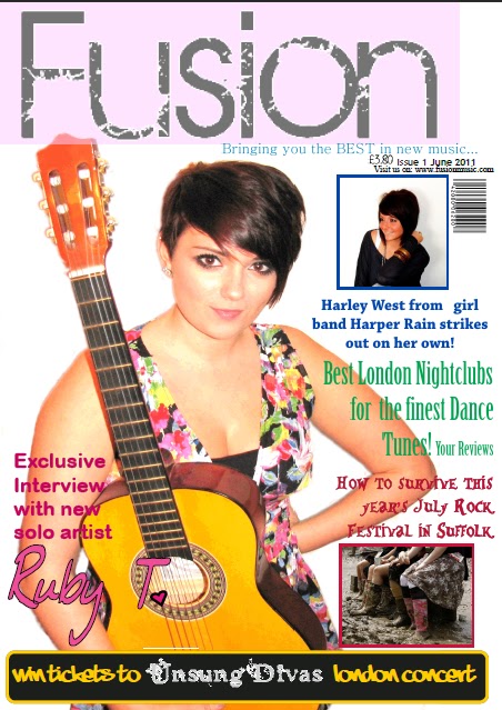
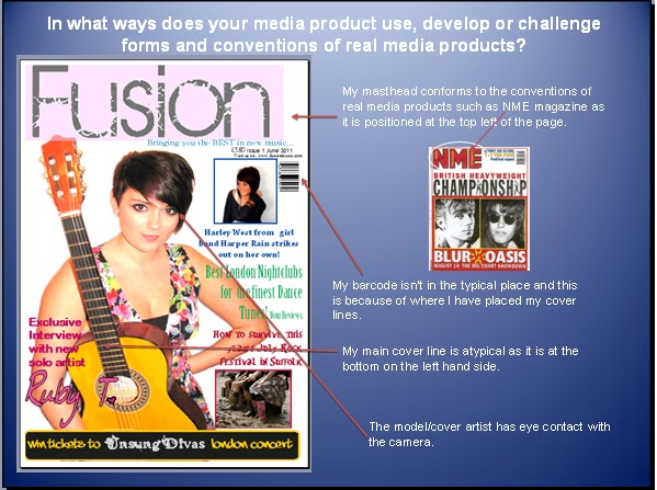
Even the very nature of my magazine which includes a variety of music genres challenges codes and conventions of a typical music magazine front cover. Although my masthead does conform to the conventions of real media products such as NME magazine it does develop it by not being in a typical block colour. Instead, my masthead is in an urban style with a block of light colour behind it. The tagline underneath 'bringing you the BEST in new music' does conform to codes and conventions in terms of it's positioning. The barcode on my front cover is not in the typical place that you’d find it on other magazines as you can see by NME magazine. It is placed in this specific place due to where I have positioned my cover lines so anywhere else I would have tried to put it would have modified my layout in a way I didn’t want it. My main cover line is also atypical in its placing as they are usually found at the top so it is the first thing you read. Due to the position of my model it was not possible to place it there so instead it is on the left hand side at the bottom. I have no rhetorical questions on my front page although I do use exclamation marks a couple of times to convey the meaning that it is something you would be interested about. I have also included a command with ‘win tickets to Unsung Divas London Concert’. Lastly, the model or cover artist has strong eye contact with the camera which draws the reader in; this is typical of music magazines.
 
As well as my Front Cover, my Contents Page also uses the codes and conventions of a typical music magazine contents page while also challenging them too. I have used a Q magazine contents page to compare it too. In my contents page there are columns which are adhere to the codes and conventions and can also be seen in my example contents page. I again conform to codes and conventions by having a separate editor’s letter however I also develop these codes by adding an image of the editor which isn’t as common in music magazines as it is in gossip magazines such as ‘Heat’. The amount of columns I have challenge conventions because usually there would be a larger main image covering more of the page as is clear in the Q magazine and then just one column down the side with one underneath the main image. Instead I have three columns with colours separating genre’s as well as lines which I have not seen in other music magazines. My use of colour also challenges codes and conventions because a lot of other contents pages stick to a black font. I however, chose to use colour because my target audience would find this appealing and because the different genres needed to be clearly separated so as to make it clear to the reader which one was which. Due to my use of thumbnail images on my contents page I would say that I am conforming to codes and conventions because many other magazines have these, although the amount I have on the page may be an example of developing typicality as there are more of them than I have seen used in any other music magazine contents page.
 
My double page spread conforms to codes and conventions in that it is set out in columns which all magazines are. The interviewer and solo artist questions and answers are in different colours- in this case black and pink- so the reader can easily identify who is who. Another way I conformed is in the way I have a bright bold title to introduce the interview, it stands out to the reader and lets them know that the feature is going to be an 'Exclusive Interview'. I have page numbers for both pages of the double page spread which again conforms to conventions. The four images on my spread page also conform, firstly because of the number of them and secondly because of the variety of shots. I have used a close-up, a couple of mid-shots and a full length one of my solo artist sitting down, this makes the reader interested and not overwhelmed by the amount of text in the feature.