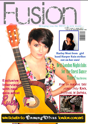
My contents page is also full of vibrant colour to capture the readers attention. It is designed to appeal to a older teenage/young adult female audience with the images of young, successful female artists, nightclubs and live festivals. The separate editor's letter located at the top of the page uses chatty, informal language so that the reader can relate to the editor and be engaged enough to carry on reading the magazine. The separation of each genre of music makes it easy for the reader to pick which features in which genres they'd be most interested in reading without them having to scan through lots of features.
The language used in my double page spread is all colloquial too, as it has been throughout the other pages. The artist's answers are down to earth so that the reader can relate to them which will encourage them to carry on reading the feature. As previously mentioned, the artist is of the same age as the target audience so this interview would appeal to them as they could see what other people their age are doing with their lives and it may inspire them to know other people's success. The images i've selected show the artist as someone dedicated to music as she plays the piano and guitar while also showing her as laid-back where she is sitting on the breakfast bar in her own home. This would appeal to the reader as it shows that the artist is just an easy-going person who loves what she does. The colour scheme of the page is evidently pink and black which therefore attracts a mostly female audience.


No comments:
Post a Comment